
Wait, they officially unveiled Canada and Czech Republic's Olympic jerseys? I must have a look!
...
And what do you know, they surely look like Nike's work. Not for the better either.
Let's start with Canada's jerseys. It was leaked a while ago, and I had a post (Part 2 of this tragic tale) already written about it, but I'll go again since there is much more to see.
(images from BCLocalNews.com)

And it wont face competition from this next set:
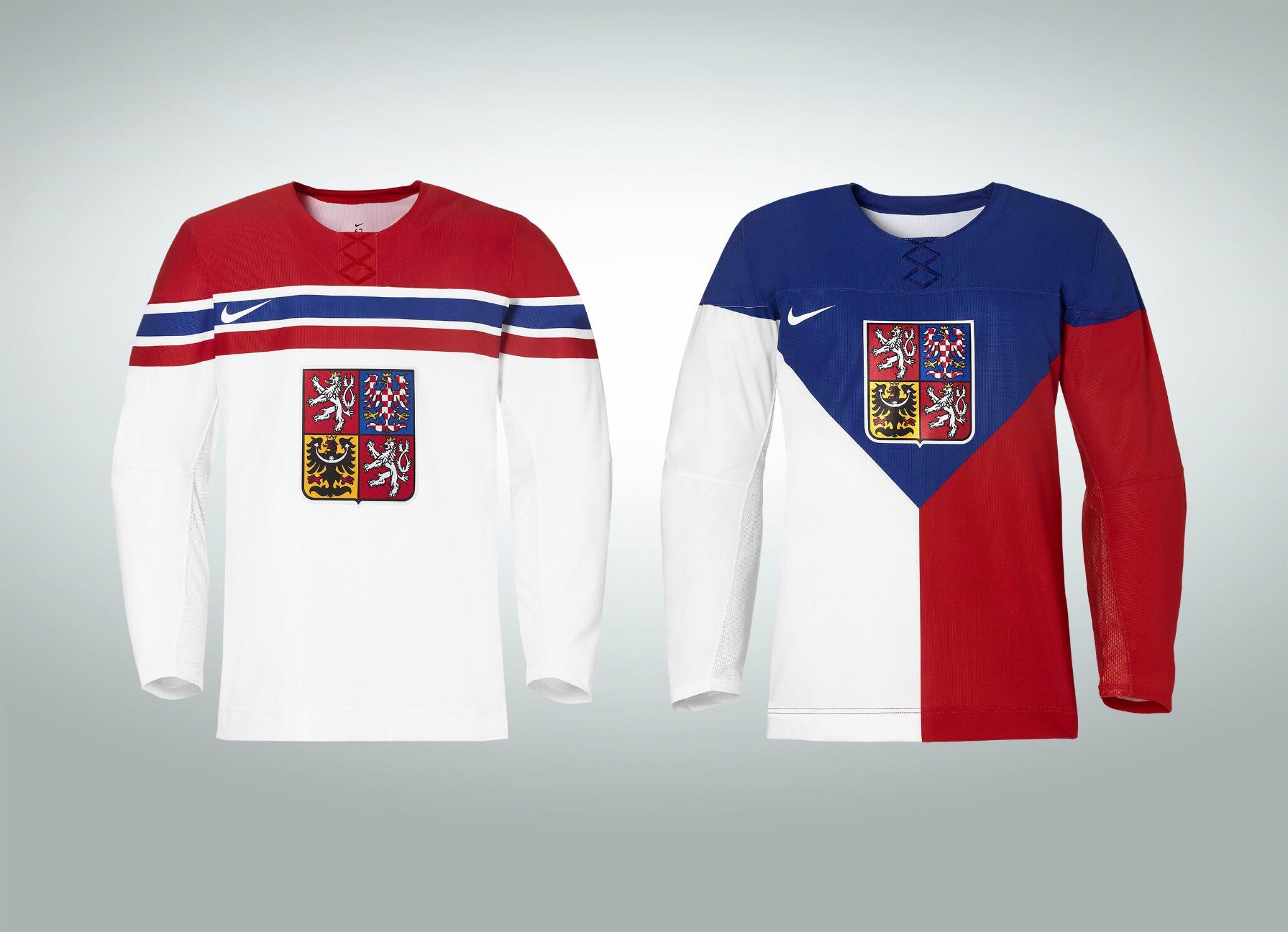
Yikes.
Of course, they have the faux-laces and the Nike mark on the side, so it looks true to Nike's form so far. The arms are bare, the dark uniform isn't exactly all dark, the white jersey's striping looks like it belongs on a soccer uni, etc. etc. The only thing missing is the decorations on the shoulders, which is probably good. There's nothing flamboyant about the white jersey. It's a very plain, simple jersey with weird shoulders that make it look like a vintage soccer jersey. Thats cool I guess, that's what the Americans (and somewhat the Canadians) have so far. But then we get to the "dark" jersey. Half of it is white, which a) doesn't make it a good dark jersey, and b) although we can't see it now, does that mean the numbers are going to be different colours? That's not a good look for anybody. Plus is it that bad of a thing to have your crest closer to the middle of the jersey? All of these jerseys besides Canada's have the crest in a funky spot, leaving the bottom bare of making the uniform feel unbalanced. It just looks weird. Carolina did it to their jerseys this year:
(image from sportslogos.net)

My biggest problem with the jersey: what if the Czechs play the Russians, and the Russians wear their "white" jersey while the Czechs wear their "dark" jersey?

Oh those Russians...
Seriously though, this is going to be so painful to look at (much like my pixelly version of the Czech jersey here, apologies). If you see two of these guys go into the boards, how can you tell where one player starts and one ends? I'm highly surprised the IOC or IIHF hasn't shut this jersey down for the same reason. There is a reason why most dark jersey have between 0 and <30% white on them.
That's my rant for the day. My final verdict is that the Czech jersey is just plain crazy, and the Canadian jersey isn't great, but good considering my expectations with Nike at this point. What do you think about these jerseys?
I wanted a jersey as my christmas present...now I'm not so sure...
ReplyDeleteUnless you're a Dallas Stars fan, this year has been pretty weak for new jerseys, but the Flames have a new 3rd coming and hopefully a few new outdoor jerseys, so hopefully something cool comes out. But a Canadian hockey jersey for Christmas this year? Meh.
ReplyDeleteYea I'm thinking I won't be asking for a Canadian one haha
ReplyDelete