
All images courtesy of nhluniforms.com.
30. Carolina Hurricanes
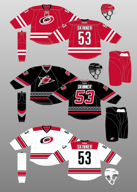
These jerseys were just released almost 2 months ago, and immediately I recognized it as my least favourite NHL jersey. It's a Team Canada rip, for one. I'm not a fan of the unmatching striping pattern between the home and away, and the logo looks awkwardly high up on the jersey. Plus I was a sucker for the red "warning flag" patterns on their old jerseys, which made them unique. This just makes them bland.
29. Tampa Bay Lightning
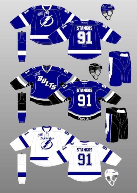
Not only are these 3rds awful, the jerseys are overly simple, the logo is overly simple and not very impressive, and the logos are mismatching with one having the wordmark and one not. I'm not a wordmark fan at all, but have it on both or none if the logo is staying, because otherwise one jersey looks cluttered and one looks bare.
28. Florida Panthers
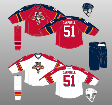
Not much to say about this one, they're just meh. I've always loved the Panthers logo, but their original jerseys looked much more creative and original than this.
27. St. Louis Blues
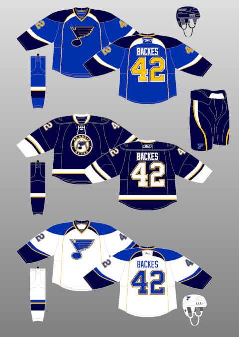
Nothing bad about these jerseys, but like Florida's, they're not that impressive either. I might be a traditionalist, but I associate the Blues with the blue and yellow colours, or the red diagonal striping pattern of the Hull era. When they first went to double blue, it looked cool. But now they changed the striping pattern, gave them a weird "modern" yoke, and have that awkward yellow arch. Yes, maybe it's a bit of symbolism, but I just don't like the look of it. I don't mind the 3rd much though.
26. Washington Capitals
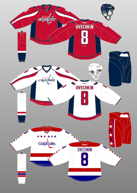
As much as I love the 3rd jersey, I just feel that their regular set is just not very attractive. Plus red and blue is used way too much in the league (or all of pro sports anyway), and I thought their old light blue and black pattern was exceptional. The design and colour scheme were original, much unlike these.
25. Ottawa Senators
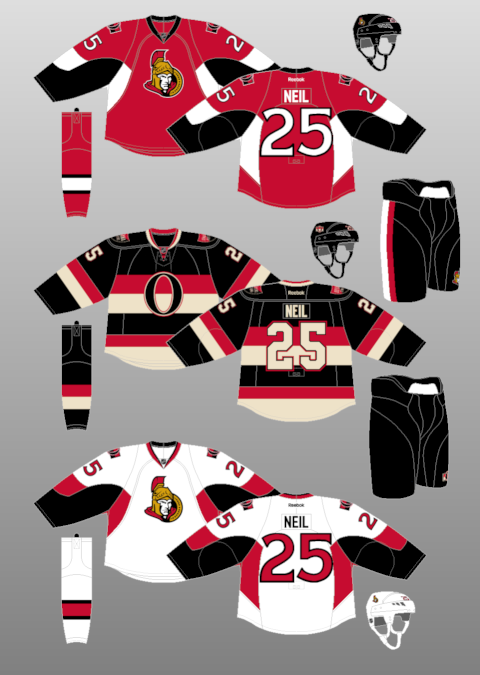
I never got the "pit-stain-turned-cuff" pattern, which is the black on their jerseys. It just makes the jersey look really... disproportionate? I'm not sure. The 3rd jersey, however, is one of the sharpest in the league. I wish Ottawa adapted that sort of style and history into their regular set.
24. Columbus Blue Jackets
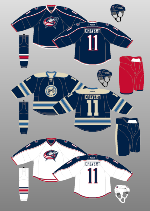
This really belongs back with Florida, but it moves ahead simply because of their 3rd jersey, which I would argue is one of the best jerseys of all time. For a team with little history, that jersey makes them look as old as Les Habs.
23. Pittsburgh Penguins
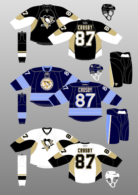
This is one team that I would say older isn't better. I never understood the baby blue jerseys with the yellow-black penguin logo. So they improved with time. But I think their yellow and black jersey days were better, or even the pre-Reebok gold-black jerseys, because they had a striping pattern that at least set them apart. Now they just look like Senators jerseys.
22. Detroit Red Wings
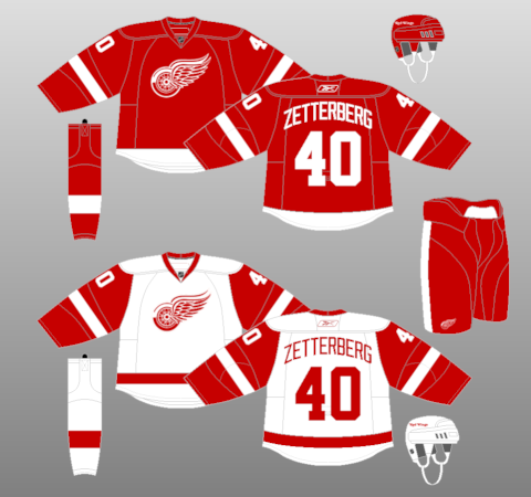
Yes, you shouldn't mess with tradition, especially with a history like Detroit's. There is nothing really wrong with this jersey, it's a classic. Its just not THAT exciting to look at, and artistically really basic.
21. Calgary Flames
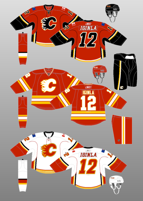
The 3rd jersey here is really cool, but I'm not sure about the rest. Calgary has experimented with new patterns since those "throwback" jersey was their regular one, with some good and some bad. These are meh. I liked the 1995 style, and then the next set after that, but these were an artistic decline.
20. Los Angeles Kings
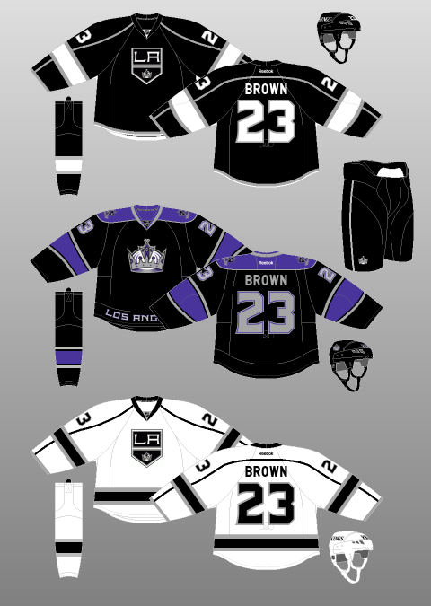
I'm all for classic, and I'm really glad they brought back the Gretzky-era black and white back. Its a colour set lost in the league. However, the style of the jersey isn't really unique, and I wish they made the logo look more authentic 90s.
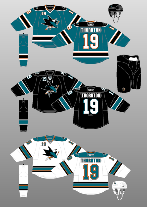
19. San Jose Sharks
18. New York Islanders
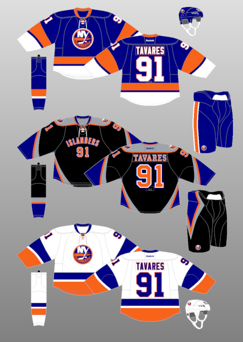
The main jerseys tribute to their classic colours, as they should. I don't have too many complaints about their main set. But those 3rds are downright awful. So bad, I'd rather wear the Captain Fishstick jerseys. Yikes.
17. Buffalo Sabres
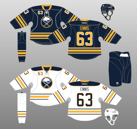
I like how they went to the throwback style, while keeping the Buffaslug colours. It works well, and is definitely an improvement. However, I for one miss their "Goat-head" red-black era. This also loses points because of what the 3rd jersey sounds like it will look when its released later this summer. Yellow on front, blue on back? Uh oh.
16. Vancouver Canucks
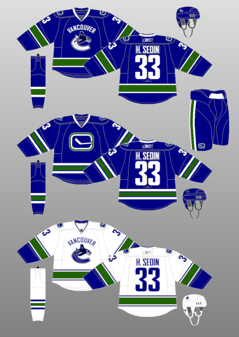
Cue the hate. As much as I like the colours, the obvious retro style, and the 3rd jersey, their main set doesn't appeal to me. For a team that has had so many original (some good, most bad) designs, this is more bland than most. Plus as I said earlier, I'm not a huge fan of the wordmark.
15. Dallas Stars
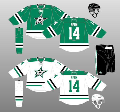
The logos, despite making me want a Starbucks beverage, are pretty awesome. The colour scheme is original and unique to the rest of the league. The jerseys are okay at best. But still, a fairly cool new set.
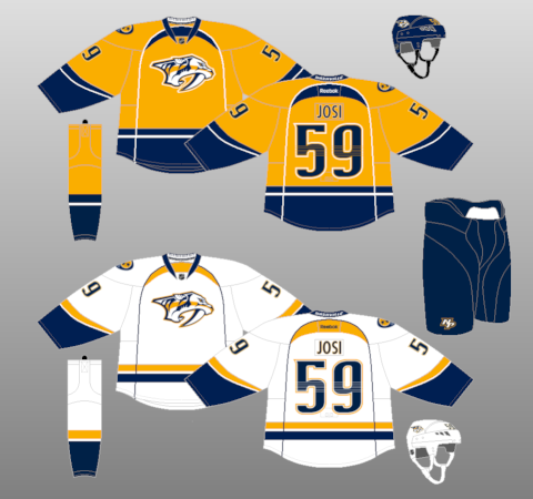
14. Nashville Predators
13. Minnesota Wild
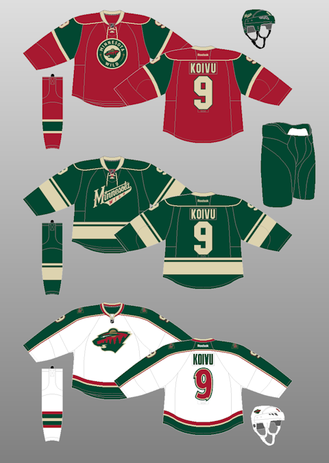
I'm a huge fan (unlike many) of the red-green colour scheme, and the bear-head logo. But I don't like the mismatching of the jerseys. The home red looks way too christmasy. The away white should be the off-white yellow to match the home set. The 3rds are cool, and should really be their regular jerseys (like the Iowa Wild this year)
12. New Jersey Devils
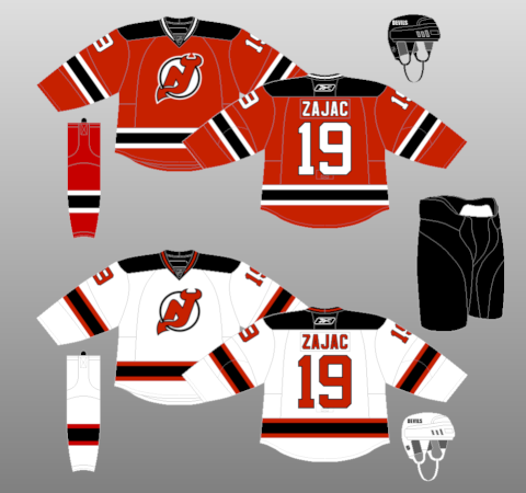
New Jersey hasn't changed their jerseys since they were red-green in the early 90s. This is a good thing. The red and black make them look devilish, not to mention original. Their simple, yet not too simple, style has stood the test of time, and hopefully will for a long time longer.
11. Toronto Maple Leafs
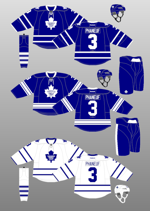
Just shy of the top 10 is Toronto's current set. They could fiddle with the regular set's striping to look a bit more creative and balanced, but it looks like a Maple Leafs jersey always has and always will. They lose out on the top 10 because of their 3rd jersey. I don't understand the point of their "throwback" logo, that just looks like an awkward remake of the current logo, and really doesn't reference any of their other logos of the past.
10. Anaheim Ducks
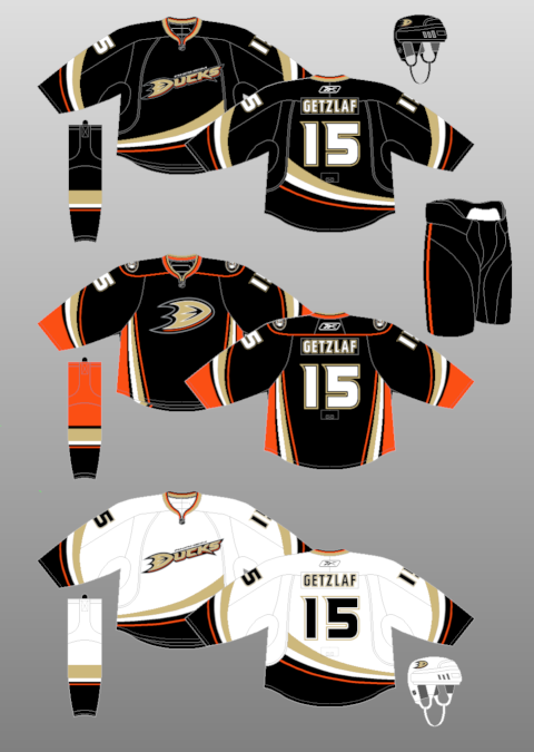
These jerseys are wickedly awesome. I do miss the Mighty Ducks branding, and the highly original colour scheme that went with it, but they rebranded nicely with an entirely new colour scheme and style. I love the striping pattern. These would probably be near the top of my list, if it wasn't for their 3rd jersey. Orange is a nice secondary colour, but they had to flaunt it everywhere, and put in a very basic pattern on the jerseys to boot. Whole lotta meh right there.
9. New York Rangers
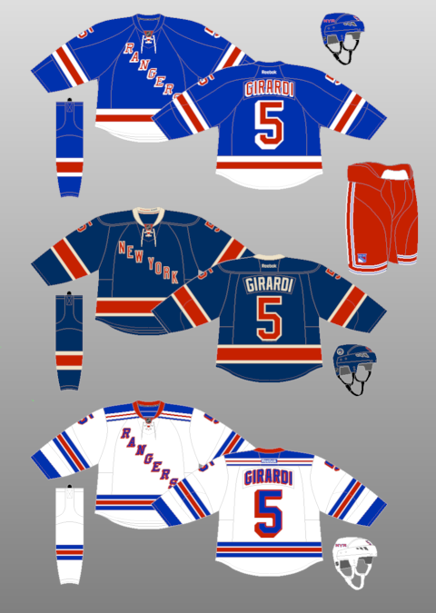
Aside from Montreal and Boston, I don't think there is a more recognizable jersey in the NHL. The jersey style has lasted forever, with very minor changes, and has stayed visually pleasing. Again, not a huge fan of the mismatching stripes, but in this case it's fairly minor. The yokes in the white jersey are very original, but such a pattern in the blue jersey would make it look too busy. I also really like the 3rd, a good throwback that really isn't a throwback, but just looks old and classic. It works well.
8. Phoenix Coyotes
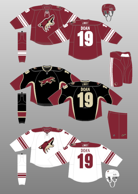
Simply put, when they Coyotes rebranded in 2003, they went from looking like a gimmick team, to looking like one of the classiest teams in the league. The colours are simple but unique, the logo is fresh and impressive, and theres just not much that you can complain about with these jerseys.
7. Edmonton Oilers
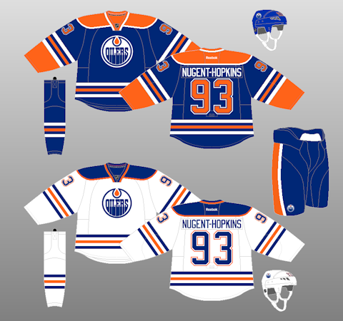
Being the traditionalist that I am, I love seeing Edmonton in these classic colours, and ridding themselves of the awful colour scheme before this, and the funky 3rd jerseys that came with it. This loses some value because it isn't entirely an original colour scheme, sharing it primarily with the Islanders. But all in all, these are great classic jerseys that have waited too long to come back.
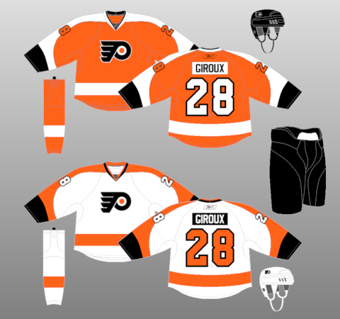
6. Philadelphia Flyers
5. Boston Bruins
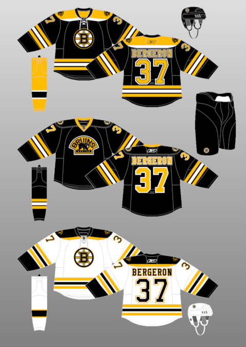
While the classic red-blue-white style is shared through many teams, there is only one true black-yellow team. These are, in my mind, the most classic and original jerseys in the league, beyond the Canadiens, Leafs, and Rangers. However, the only drawback (and why this lost so many points) is the 3rd jersey, which looks bear...I meant bare, and takes away from what is a beautiful, original set. Boston is a team that, like Detroit, Toronto, Montreal, and (to some extent) the Rangers, have no need for a 3rd jersey, outside of classic throwbacks.
4. Chicago Blackhawks
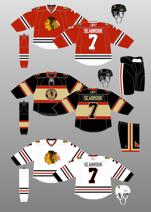
I really don't have much to say about these jerseys. They were the original red-black team, and carry those colours well to this very day. Those 3rd jersey throwbacks are also extremely well done. However, while I make a case for some traditional teams for mismatching stripes, I feel they take away some in these jerseys. Thats my only justification to make them 4th, other than the next 3 are just that damn cool.
3. Colorado Avalanche
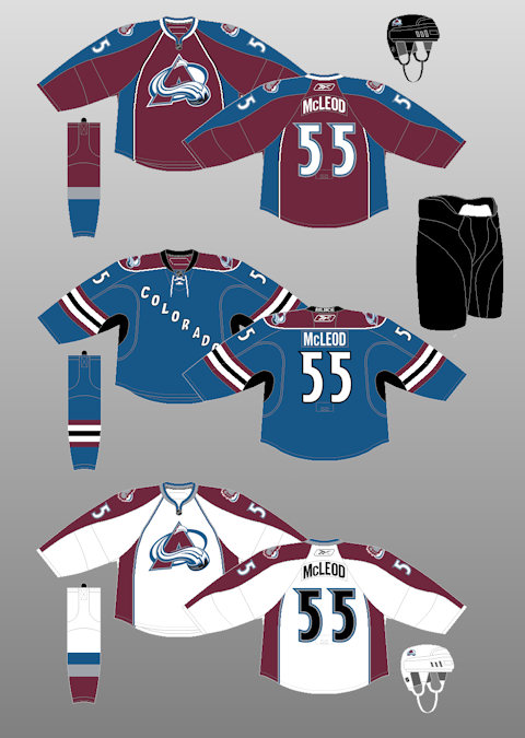
When I first thought of this list, I thought there would be no way Colorado makes it this high. But on second thought, they deserve to be. In my opinion, they have the best colour scheme of any team in the modern expansion era, and have the 2nd best logo in the league, one that has stayed untouched since their creation in 1996. While I feel their modern-style jerseys have been a bit of a decline, the jersey still flows with that great colour, and the 3rd jersey is very throwback-esque. I feel this jersey set (and previous jerseys, which were better than this set) are very underrated in the history of hockey jerseys.
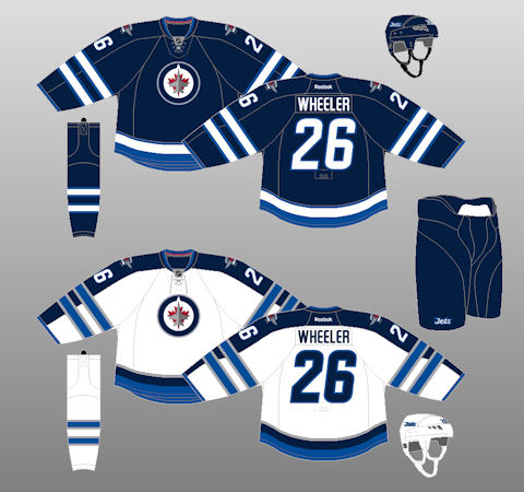
2. Winnipeg Jets
1. Montreal Canadiens
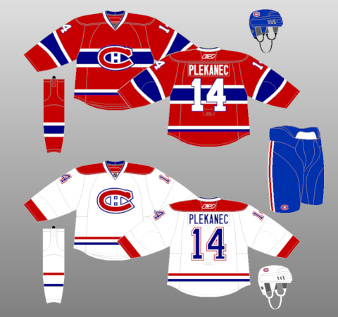
When I was thinking of this list, I really didn't want to put Montreal 1st. I felt their jersey is way overhyped, and really never cared for the mismatching of the striping. But who am I kidding? The white jersey hasn't been changed since 1941, the dark jersey since 1917, all aside from minor changes of course. The red-white-blue scheme has so much meaning to it other than aesthetics, and the logo is essentially a symbol not just for the NHL, but for hockey all over. My only thought would be that maybe the white jersey could use some form of arm striping. Not the chest striping tho, that would look too busy, and the white of the jersey is really classic. But maybe just a little bit of arm stripes. Just my thought. Otherwise, this IS the NHL's best jersey set, and likely best there ever will be.
Well glad you read through all of that. Hope you enjoyed my list and please feel free to rank your own or tell me your opinions, favourites, or least favourites in the comment section. Thanks for reading.
No comments:
Post a Comment